
Before & After: On Wychwood Hill

What started as a "kitchen refresh" quickly became a major renovation, leaving hardly any room or hall untouched.
The client's directive out of the gate was to make their old house "new again." Having purchased the home over twenty years ago, and renovated and designed everything at that time, it had seen the birth of their two (now grown) children and the arrival of their pup Case.
Beloved and well-lived, it was time to hit the reset button so they could continue to enjoy their home for years to come. Recreating spaces they could use in new ways while respecting the integrity of the Arts & Crafts style home, we began designing spaces that reflected the people who lived in them and had an updated yet timeless feel.
The Kitchen
Remember when people were saying, “brown is the new black”? Well, I wouldn’t go that far, but I would say that green might be the new grey when it comes to kitchens. When you find a house and a client unique enough for a green kitchen - it’s hard not to do everything within your power to make that happen. We didn’t reinvent the wheel in this kitchen; the layout is similar to how it was before, but we added details everywhere that make every last inch of this kitchen unique and spectacular.
This family loves to cook, and we needed to ensure the kitchen could accommodate the many cooking gadgets and pantry staples they like to keep on hand. We made space for a larger fridge and worked to create even more pantry storage while tucking away the everyday use appliances conveniently.
My favourite feature is the hidden coffee/tea/toast station that can be left open for everyday use and hidden away when entertaining. When the doors open, they can easily access the microwave, toaster, soda stream, coffee maker, etc. And when the doors are closed, there is a hidden kill switch to ensure all the appliances are off and safely hidden behind closed doors.

KITCHEN: BEFORE

KITCHEN: AFTER

KITCHEN: AFTER
This kitchen has so many unique features that it is hard to know where to start. The backsplash is from Cle Tile, which ties in the feel of old & new. They are hand-made clay tiles, each unique in colour, texture, and size. This helps make it feel like this kitchen was almost original to the house while still feeling fresh and clean.

KITCHEN: BEFORE

KITCHEN: AFTER
Instead of going with your standard shaker door, I decided that since we had the custom-made kitchen, we should amp up the style and create a custom shaker that reads very clean on the entire pantry wall but a little more special. The clients joke that the pantry is made for giants; it has SO much storage.

KITCHEN: AFTER
Having recently purchased a new oven and dishwasher, we integrated them into the design, upgrading only the due appliances. The fridge was upped in size, and we went with a top-of-the-line Wolf cooktop. The mix of brass, stainless, and black metals speaks to the rest of the house, which has original door handles and elements from different periods of time.
An easy indoor/outdoor machine washable Dash and Albert runner adds softness and protection to the high traffic areas, and the updated pot lights brighten the entire space. The coffered ceiling they had put in 20 years ago was crowding the room, and we opened it up by removing them and bringing the cabinets to their full height. Not having been a designer twenty years ago, I will always wonder why the ’90s kitchens all seem to have dropped cabinets with false bulkheads - did people have a problem with more storage?!

KITCHEN: BEFORE

KITCHEN: AFTER
The Powder Room
As a last-minute add-on, we worked with what was there and gave this main floor powder a significant facelift. We added a gorgeous woodland wallpaper, painted out the existing vanity & mirror, updated our sconces and faucet, switched out the California shutters for drapery, and voila! A new, old powder room - that complements the rest of the design updates without breaking the bank.
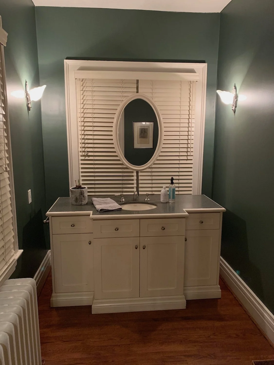
POWDER ROOM: BEFORE

POWDER ROOM: AFTER

POWDER ROOM: AFTER

POWDER ROOM: AFTER
The Dining Room
This dining room was also an add-on. The dining set was a handmade wedding gift and, therefore, extremely sentimental; that being said, the iced oak looked dated and needed some love. The popcorn stucco ceiling and walls were also seriously overdue for an update, which is what we did. Though hard to read in a photo, I sourced one of William Morris’s original prints for the wallpaper. As one of the founders of the Arts & Crafts movement, there couldn’t have been a more perfect fit. We selected a soft tone-on-tone green in the Willow print above the original wainscotting in the space. Having never been satisfied with the light fixture, we upgraded to a gorgeous brass fixture by a Montreal-based designer, Lambert et Fils. The result was an updated, airy space that worked beautifully with the adjoined kitchen.

DINING ROOM: BEFORE
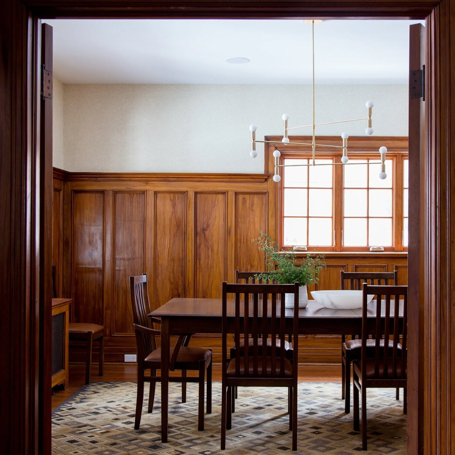
DINING ROOM: AFTER
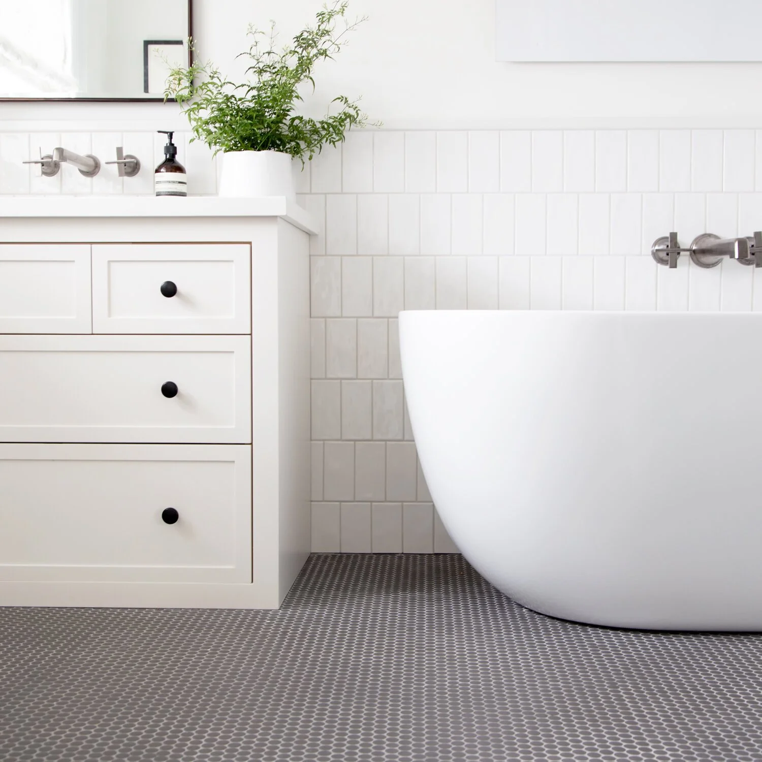
The Primary Ensuite
Bathrooms don’t have to be showy to be show-stopping. This bathroom had a small footprint and a strange free-standing tub/shower combo. The client loved the sort of “old-fashioned French” feel the original bathroom had, so we created a fresh take on a classic combo with that in mind. Black & White + Subway Tile & Penny Round. I have to say, this space feels both traditional and modern, not unlike a hotel bathroom you might squeal with excitement about upon discovering.

PRIMARY ENSUITE: BEFORE

PRIMARY ENSUITE: AFTER
We went with a warm white subway tile in a slightly more modern pattern - vertical brick lay - and topped it with a clean quartz trim piece. The matte black, somewhat textured penny round floor tile was hard to find, but it is one of my favourite features as it ties in the shower floor and the rest of the space so beautifully. Given this master bath did not have the room for a tub, shower, and double vanity, we decided to work with a single vanity - which I designed to maximize storage (dropping it right to the floor) and tuck in a sleek medicine cabinet mirror for even more hidden storage.

PRIMARY ENSUITE: BEFORE
PRIMARY ENSUITE: AFTER

PRIMARY ENSUITE: AFTER

PRIMARY ENSUITE: AFTER
The Kids Bath
This bathroom was what I like to call a builder's bath. They had started a reno a few years ago and only partially completed the job. Though the bathroom had everything you "need," it also had an overwhelming amount of "builder beige," which wasn't getting anyone excited to be there. This sweet little bath now has everything you could need. We glammed it up with a gorgeous crackled blue tile in a more modern vertical stack lay; we didn't go over the top on the hardware sticking with chrome, paired with brass accessory hardware. The wall-mounted faucet maximizes the counter space, resulting in an airy, bright, and beautiful bathroom!

KIDS BATH: BEFORE

KIDS BATH: AFTER

KIDS BATH: AFTER

KIDS BATH: AFTER
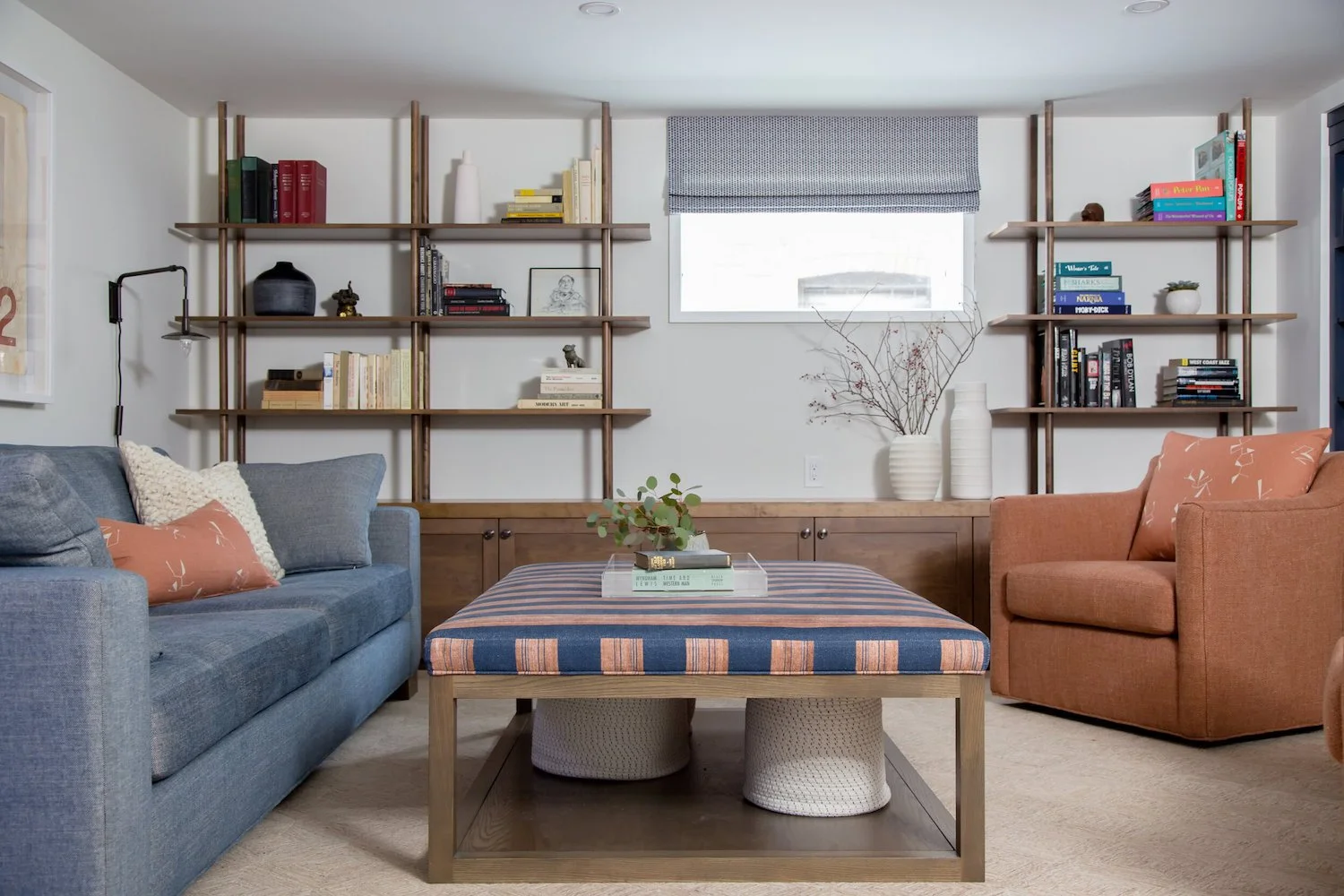
The Rec Room
This basement rec room was a blank slate full of opportunity. Instead of playing it safe and keeping it neutral, we infused it with colour and character. This room is a TV room, games room, reading room, and family + pup hang-out room. Everything is super comfortable, and the swivel chairs whip around as the perfect seat to a hidden gaming station. One of the clients is a retired literary professor, so the only actual directive was that there were LOTS of bookshelves. We delivered and in style!

REC ROOM: BEFORE

REC ROOM: BEFORE
REC ROOM: AFTER

REC ROOM: AFTER

REC ROOM: AFTER
For serious wine lovers (I mean, who isn’t really), we converted the end of the hall into a showpiece that greets you as you come down the stairs. The best part is the room is climate-controlled and displays all the beautiful bottles in their collection.

REC ROOM: AFTER

REC ROOM: AFTER
The Laundry Room
This basement laundry feels nothing like, well, that. It is light-filled and amenity-filled! I would be happy to do laundry in here any day with a sweet little powder room (not pictured), dog shower, and full-blown laundry zone. A slight nod to the kids' bath, we used a mini hex on the shower floor and a teal blue subway tile that adds a pop of colour and fun to an otherwise neutral space.

LAUNDRY ROOM: BEFORE

LAUNDRY ROOM: BEFORE

LAUNDRY ROOM: AFTER

LAUNDRY ROOM: AFTER